Trying a fun brochure color combination?
- Danzengcaizhen .
- 2023年10月19日
- 讀畢需時 1 分鐘

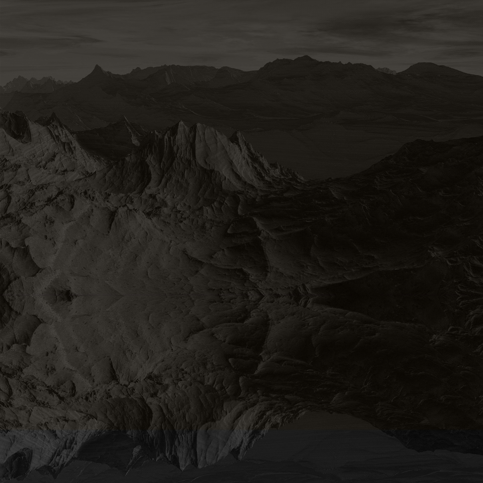
I designed a brochure cover, and for the material I usually use the camera mode on my iPhone to take some photos. You can usually get the light source, brightness, color, and other image-related elements of the scene through the lens, and then through the viewfinder to get the best results. It can also be portrait mode. In portrait mode, you can choose different lighting effects. For example, studio lights can illuminate facial features, contour lights can be used to achieve dramatic directional lighting, stage lights can make spotlighted subjects stand out, and high-key monochromatic lights can bring out grayscale subjects against a white background. I process at least ten images in the Camera Raw plug-in, adjusting exposure, highlights, shadows as needed. I need to learn more about design and study more design works and articles about the use of color. So that more ideas can be implemented in future designs.


Here are my attempts at two different versions of the design


留言